If you’ve ever Googled “ADA compliant website” at 11 PM in a mild panic because a client mentioned a lawsuit, welcome. You’re in good company. Half the internet is having this exact crisis right now, usually right after someone from legal forwards an email with the subject line “URGENT – please read.”
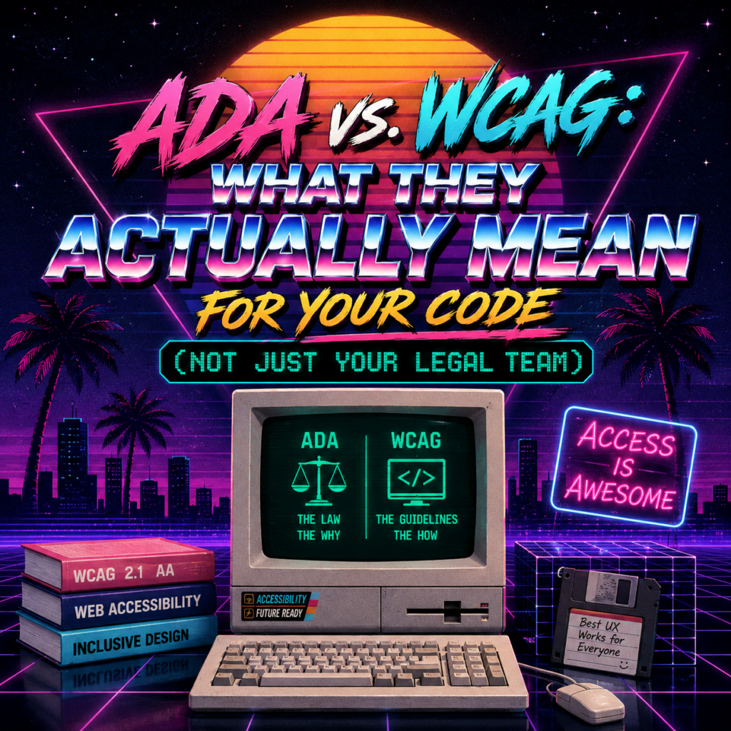
Here’s the thing nobody explains clearly enough: ADA and WCAG are not the same thing, and mixing them up is like confusing “the speed limit” with “the laws of physics.” One is a rule humans made. The other is closer to how the universe (or in this case, assistive technology) actually works. You need both, but they do very different jobs.
Let’s sort this out — legal side first, then the part you’re really here for: what to actually put in your HTML.
ADA: The Law That Doesn’t Tell You What to Build
The Americans with Disabilities Act is a U.S. civil rights law from 1990. It says people with disabilities can’t be discriminated against, including when it comes to “places of public accommodation.” Originally that meant ramps into buildings and accessible bathroom stalls. Over the last couple decades, courts have increasingly decided it also means your website.
Here’s the plot twist that trips everyone up: the ADA doesn’t contain a single line of technical web accessibility requirements. No pixel counts. No contrast ratios. No “thou shalt label thy form inputs.” It just says: don’t discriminate, provide equal access. That’s it. It’s a principle, not a spec sheet.
Which is a bit like your boss telling you to “make the app better” with zero further detail. Technically an instruction. Not exactly actionable.
So how does anyone know what “equal access” means in code? That’s where the other half of this article comes in.
WCAG: The Actual Instructions
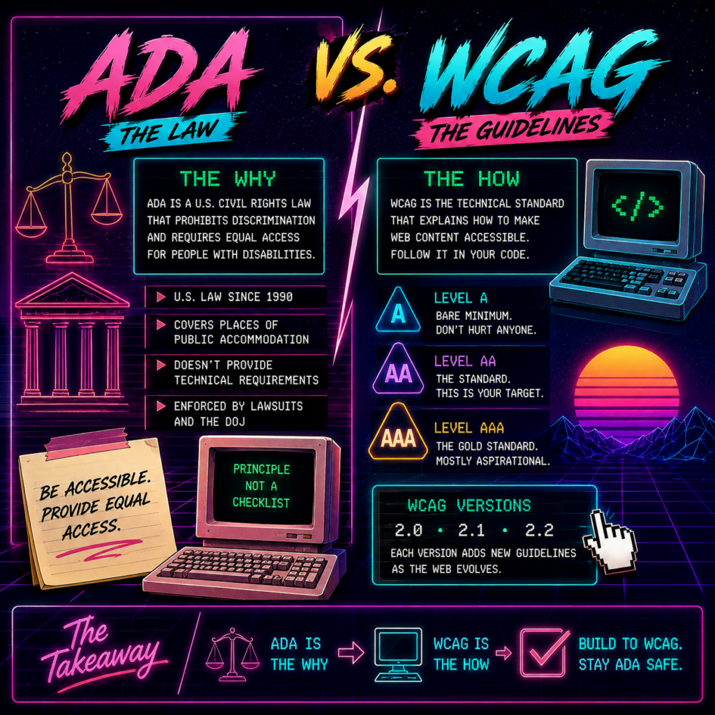
The Web Content Accessibility Guidelines, written by the W3C (an international standards body, not a government), are the technical specification that ADA never bothered to write. WCAG is organized into three levels:
- A — the bare minimum. Basically “please don’t actively hurt anyone.”
- AA — the standard most laws, lawsuits, and reasonable humans expect. This is your target.
- AAA — the gold standard, rarely required in full, mostly aspirational (like flossing every single day).
Current versions in circulation: WCAG 2.0, 2.1, and 2.2, each one bolting on a few more criteria as the web gets more complicated (2.2 added things like better guidance for authentication and drag interactions, because apparently we needed guidelines to remind us drag-and-drop is a nightmare for a lot of users).
So How Do They Fit Together?
| ADA | WCAG | |
|---|---|---|
| What it is | Law | Technical standard |
| Who wrote it | U.S. Congress | W3C (global) |
| Level of detail | “Be accessible” | “Here’s exactly how” |
| Enforced by | Lawsuits, DOJ | Nothing on its own |
The ADA is the “why.” WCAG is the “how.” In 2024, the DOJ actually closed the loop for government sites, finalizing a rule requiring state and local government websites to meet WCAG 2.1 AA specifically. Private businesses aren’t (yet) bound by that exact rule, but courts have been treating WCAG 2.1 AA as the de facto benchmark for years. So when someone says “make it ADA compliant,” what they mean — whether they know it or not — is “make it meet WCAG 2.1 AA.”
Translation: you can’t actually build to the ADA. You build to WCAG, and that’s what keeps the ADA lawyers away from your inbox.
Okay. Legal stuff handled. Let’s write some code.
Turning WCAG Into Actual HTML (Where the Real Work Happens)
1. Use Semantic HTML Like You Mean It
This is the single highest-leverage thing you can do, and it costs you nothing. Stop building buttons out of <div>s. A <div> with an onclick is not a button, it’s a button cosplaying.
<!-- Please don't -->
<div class="button" onclick="submit()">Submit</div>

<!-- This one already works with keyboards, screen readers, everything -->
<button type="submit">Submit</button>
Same goes for page structure. Landmarks like <header>, <nav>, <main>, and <footer> let screen reader users jump straight to what they need instead of tabbing through your entire nav bar one link at a time, every single visit, forever.
<header>...</header>
<nav aria-label="Main navigation">...</nav>
<main>...</main>
<footer>...</footer>
2. Headings Are Structure, Not Font Sizes
If you’ve ever used an <h3> because it “looked about right” — we need to talk.
<!-- Chaos -->
<h3>Welcome</h3>
<h1>Small text I wanted here for some reason</h1>

<!-- Order, logic, sanity -->
<h1>Page Title</h1>
  <h2>Section</h2>
    <h3>Subsection</h3>
Screen reader users frequently navigate a page by jumping between headings. If your heading order reads like a choose-your-own-adventure novel, you’ve made their day measurably worse.
3. Images Need Alt Text (Even the Ones You Think Are Obvious)
<!-- Meaningful content -->
<img src="chart.png" alt="Revenue grew 40% from Q1 to Q4 2025">

<!-- Purely decorative — tell assistive tech to skip it -->
<img src="divider.svg" alt="" role="presentation">
Don’t write alt="image of a chart". Nobody has ever needed to be told they’re looking at an image of an image.
4. Forms: Label Everything, Always
<label for="email">Email address</label>
<input type="email" id="email" name="email" required aria-describedby="email-error">
<span id="email-error" role="alert">Please enter a valid email</span>
Placeholder text is not a label. It vanishes the moment someone starts typing, and screen readers don’t reliably announce it. If your only “label” is a placeholder, you’ve built a form that gaslights half its users.
5. Color Contrast (Yes, There’s Actual Math)
WCAG AA gives you real numbers to hit:
- Normal text: 4.5:1 contrast ratio
- Large text (18px+ bold, or 24px and up): 3:1
This lives in your CSS, not your markup, but it’s one of the most commonly failed criteria on the entire web. Light gray text on a white background might look “minimalist.” It also might be functionally invisible to a meaningful chunk of your users. Run it through the WebAIM Contrast Checker or Chrome DevTools before you ship it.
6. Keyboard Navigation: Don’t Murder the Outline
/* The crime */
*:focus { outline: none; }

/* The redemption arc */
button:focus-visible {
  outline: 2px solid #005fcc;
  outline-offset: 2px;
}
Removing the focus outline because it clashed with your design is the web dev equivalent of removing seatbelts because they clashed with the upholstery. Restyle it, don’t delete it.
Also, add a skip link. Nobody wants to Tab through nineteen nav items to reach the actual content, every single page load.
<a href="#main-content" class="skip-link">Skip to main content</a>
7. ARIA: The Seasoning, Not the Meal
The golden rule of ARIA is genuinely: don’t use it if native HTML already does the job. ARIA is for filling gaps, not replacing basics.
<!-- A genuinely custom widget that needs it -->
<button aria-haspopup="listbox" aria-expanded="false" id="dropdown-btn">
  Select option
</button>
<ul role="listbox" aria-labelledby="dropdown-btn" hidden>
  <li role="option">Option 1</li>
</ul>
<!-- Announcing dynamic changes, like "Item added to cart" -->
<div aria-live="polite" id="status"></div>
The attributes you’ll actually reach for most: aria-label, aria-labelledby, aria-describedby, aria-expanded, aria-hidden, aria-live, and role. Anything beyond that and you’re probably overengineering.
8. Video and Audio Need Captions
<video controls>
  <source src="demo.mp4" type="video/mp4">
  <track kind="captions" src="captions_en.vtt" srclang="en" label="English">
</video>
Captions are required at AA. Audio descriptions creep in at AAA for certain content. Either way, “just watch the video” is not accessible advice.
Tools That Do Some of the Work For You
- axe DevTools — a browser extension that catches roughly a third to half of common issues automatically
- Lighthouse — built right into Chrome DevTools, gives you a score and a punch list
- eslint-plugin-jsx-a11y — flags problems while you’re still typing, if you’re in React
- NVDA / VoiceOver — actually put on the headphones and try navigating your own site. It’s humbling. Do it anyway.
The Part Nobody Wants to Hear
Automated tools are great, but they’re catching structural stuff — missing labels, bad contrast, unlabeled buttons. That’s maybe a third of what WCAG actually cares about. Whether your alt text is meaningful rather than just present, whether your focus order makes logical sense, whether a screen reader user can actually complete your checkout flow without wanting to throw their laptop — that requires an actual human testing it. Preferably one who isn’t you, because you already know where all the buttons are.
The One-Sentence Summary
The ADA tells you accessibility is legally required. WCAG 2.1 AA tells you exactly what that looks like in code. Build to WCAG, and the ADA mostly takes care of itself — no lawsuit-induced 11 PM panic Googling required.